Centered column with CSS
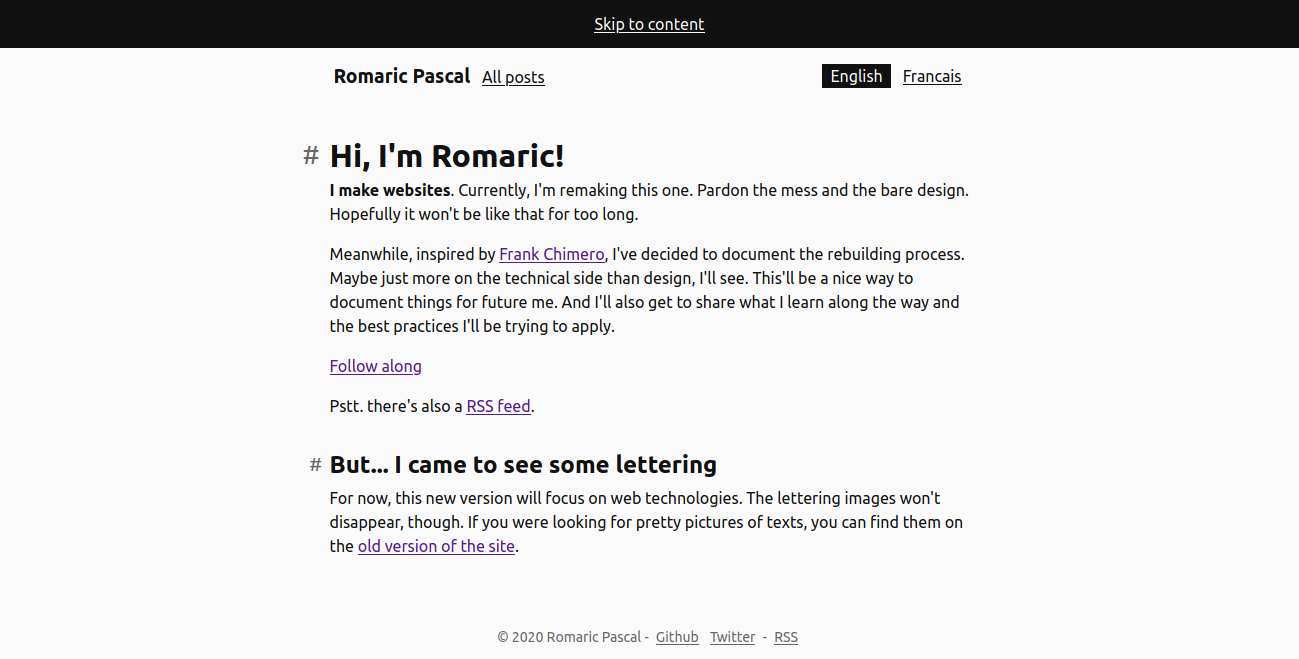
Let's take a break from the backend of this site and talk a bit about its stylesheet. The design is pretty minimal, but there's already a couple of interesting patterns. Starting with the centered column of content, with a limited width.
Maybe you're on mobile, using a narrow window, or with a large zoom, and the width doesn't seem that limited. Just a little space on the side. Here is how it looks on wider viewports:

Not letting the text run edge to edge, as it would without styling, is crucial for a good readability. This is a pretty common pattern, sometimes called a container. Let's take a peek at how to make it happen.
Limiting the content width
We're trying to control the width of the content, but we don't want to set it for all screens. We're happy to let it go full(ish) width as long as the viewport is narrow enough. What's important is that it doesn't grow wider than what we decide. This is exactly what the max-width property offers.
Depending on the litterature you find on the topic, you'll find different values for that limit, with the minimum in the 40 character per line and the maximum around 70-80. Let's say 60, as an example.
All this talk about characters leads to thinking the ch unit would be great to express that max-width. However, 60ch won't be the same width depending on the element's own font-size. Headings, usually set at a larger size, would end up with a wider column than the copy for example.
Not super isolated, so we'll rely on the rem unit. It'll keep the width relative to the base font-size of the site, allowing it to adapt to user preferences. But it won't vary from one element to another because of styles changing their specific font-size.
max-width: 45rem;Centering the content
The column now has a limited width, but it's stuck on the left hand side of the screen. To get it in the middle, we can use the auto value for its left and right margin.
max-width: 45rem;
margin-left: auto;
margin-right: auto;
Looking forward to when margin-inline will be widely supported and reduce those two margin-... properties to one. Note that we do not want to use the margin shorthand as there's no need to affect the top and bottom margin.
A little space on the outside
When the viewport is too narrow, the column reaches both edges of the screen.
It doesn't make for a pleasing experience, a little space on each side would make it so much nicer. Adding some horizontal padding is tempting, but brings in two issues:
- when the limit applies, the width of the content is no longer the
max-width. It becomes themax-width, minus twice the horizontal padding (one for each side). - it would conflict when applied to elements that have some padding already. Either we end up breaking its insides by trying to control its width, or its insides end up wreaking the spacing.
Both can be worked around. The first one can be adressed by ensuring box-sizing is set to content-box (usually it's reset to a much more convenient border-box nowadays) and the second by applying the styles to a wrapper element, rather than the one with the padding.
Not a found of those. In the end, what we want is something not quite full width, with a little space removed on each side. We can express that "word for word" with the width property and calc():
width: calc(100% - 2 * 1.5rem);
max-width: 45rem;
margin-left: auto;
margin-right: auto;
Boom! Space on the side, limited width that matches the max-width and the pattern can be applied to elements that already have padding.
Picking targets
Using the SELECTOR > * selector, it can also create a container where each children is centered. And without any specificity added to the selector preceeding > (so good these asterisks).
Compared to styling the parent directly, it'll be much easier to have elements break out of the column and be slightly wider. Not that it's impossible, it's just a bit more involved than tweaking the max-width.
.centered-children > * {
  width: calc(100% - 2 * 1.5rem);
  max-width: 45rem;
  margin-left: auto;
  margin-right: auto;
}

.wider-element {
  max-width: 55rem;
}
And that's about all there is behind the centered column of this minimal relaunch design. Now we've dealt with the horizontal centering, see you in the next article to have a look at the vertical spacing!