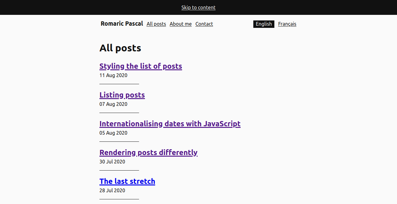
Styling the list of posts
We left the article list with its markup ready to be styled. The default <ul> styles don't really make for an enticing experience, so let's see how to turn it into its final state.
Thinking about space, again
Spacing lists of items with a transparent background requires deciding whether to use margin or padding. The transparent backgroung blurries the distinction between the space inside the elements and the space outside them.
Another way to look at it than inside/outside is deciding whether the space looks around or between the content of each items. Between translates nicely to margin, while around will likely become padding. Dividers, especially, will make the space feel "around the content". They're not the only thing though. The area offered to clicks/taps for interacting might also dictate that the space is around too.
Given the divider between each article, padding it is for the articles list. Because this padding is due to the elements being in the list, I prefer attaching the styles to the selector of the post-list rather than to the item. This makes it a central point to control the look of the list, on top of removing the default styling for <ul>.
.post-list {
  list-style-type: none;
  padding: 0;
}

.post-list > * {
  padding-top: 1rem;
  padding-bottom: 1rem;
}
With the elements properly spaced, time to add the dividers.
Painting separators
Each article is separated from its neighbour not by a full border, but a lighter small line. This rules out border for implementing it. Regardless of the solution, the styles would be born again by the .post-list selector, to keep it the centre for all styles of the list. Using the * + * combinator, we can make sure the separator appears only between each element.
There's (at least) 3 options for drawing the border:
-
an absolutely positioned pseudo element: it allows to use
min/max-widthto limit the width. It forces each item element to have aposition, though..post-list > * + * { position: relative; /* Add a border to not eat 1px from the top padding and ensure equal spacing */ border-top: solid 0.0625rem transparent; } .post-list > * + ::before { content: ''; display: block; position: absolute; /* Shift to overlap the space reserved by the border */ top: -0.0625rem; left: 0; height: 0.0625rem; width: 20%; /* Because it's a pseudo element, we can use `min-width` to ensure a minimum width */ min-width: 2rem; background: #111; } -
background-image: no extra elements (1 per item) for the browser to layout, it'll just have to paint the background. The separate
background-xxxproperties clarify quite a lot what controls the size, the position....post-list > * + * { /* Avoid eating the padding */ border-top: solid 0.0625rem transparent; /* Draws a block of #111 */ background-image: linear-gradient(#111,#111); /* Ensures the background gets drawn under the border */ background-origin: border-box; /* Instead of `min-width` we can use `max` to get similar control, however, a fallback is necessary for older browsers */ background-size: 15% 0.0625rem; background-size: max(20%, 2rem) 0.0625rem; /* Prevent filling the whole block */ background-repeat: no-repeat; } -
border-image: it's the closest to what's actually happening on the design (drawing a border between the elements), it also easily scales with the width of the border. It's also the most compact, but the property is less common to see.
.post-list > * + * {

  /* Avoid eating the padding */
  border-top: solid 0.0625rem transparent;

  /*
    Use a horizontal gradient
    with a harsh stop at 20% or 2rem,
    whichever is bigger.

    The 20% refer to the element's  `border-box`,
    which is the width the whole gradient will take.

    With fallback for where max is not supported.
  */
  border-image-source: linear-gradient(90deg, #111 15%, transparent 0);
  border-image-source: linear-gradient(90deg, #111 max(20%, 2rem), transparent 0);

  /*
    Take a 1px horizontal slice from the top.
    It'll be drawn to cover the top border of the element.

    It'll stretch vertically to match the border width,
    thanks to the default of 1 for `border-image-width`.

    Take no slices for the other sides (left/right and bottom)
    as we don't draw any border there
  */
  border-image-slice: 1 0 0;
}
Either will do to draw the separator. Varying the gradient, there's surely ways to draw dashes, but let's leave that for another article.
A large interactive area
The large text size for the title already give a good area to click/tap on. It can be further enlarged by letting people click anywhere on each item of the list. Unfortunately, wrapping the whole <li> inside an <a> is not valid HTML. It would also require some extra care with the accessible name of the <a>, to avoid the whole content of the <li> to be used for it (title followed by date). Cumbersome to consume for users of assistive tech. Let's find another route.
Instead, we can make the interactive area of the <a> inside the <li> grow to match its parent. ::before and ::after pseudo-elements can also receive interactions. Positioning one of them to cover the whole <li> will render the whole area clickable.
There's a price though, users won't be able to select the text inside the <li> anymore. It's still a lighter option than bringing in JavaScript to handle click events (and avoid firing when users are selecting text, and handle Ctrl click correctly...).
This time, it's the responsibility of each item to make enlarge its interactive area, so the styles will be attached to .post-list-item:
.post-list-item {
  position: relative;
  z-index: 0;
}

.post-list-item a::before {
  content: '';
  display: block;
  position: absolute;
  top: 0;
  left: 0;
  right: 0;
  bottom: 0;
  z-index: 1;
}
And there we are, a presentable list of articles. This leaves only the RSS feed to tackle and the site will be in its relauch state. Another list of articles, then, for the next post, just with a slightly different markup.